
I once heard a “proper” gardening guru state that the color red does not belong in a garden. Huh? I understand that there are natural color relationships that would make a tomato red look out of place next to pale pink and lavender for example, but to rule it out all together?
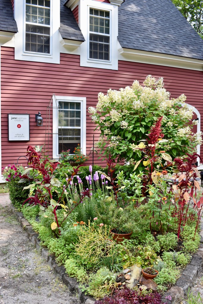
If you know my artwork you will know that I do love the color red with its long wave-length excitement. The color was a natural choice to paint our studio workshop-barn and as a result, the gardens in front of it have mirrored its tone. I love how the garden has developed into its redness. Humph proper gardener.

a study in reds
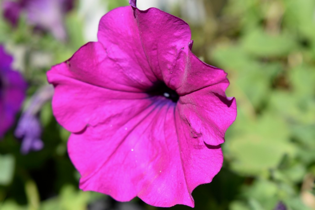
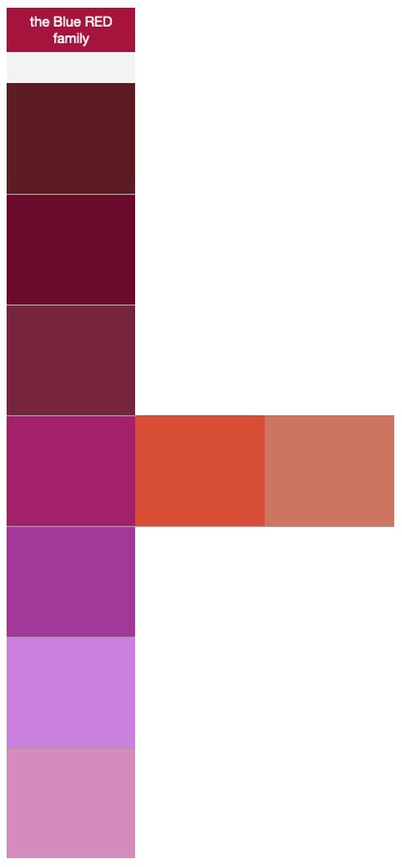
We tend to think of Red as a color all its own but from a painters point of view, it is a singular hue that many other colors can be born from making a family of related “reds”; think papa reds, mama reds and baby reds. Below are some color gradation charts showing how I used the varying shades from a family reds for my garden. Perhaps you can use the charts too for your next project; a garden, a room, a quilt or use them to perhaps just help yourself observe the world around you with new eyes.
Redly yours,
Jane


I see Tobey! Meow. Gorgeous reds, all of them.
LikeLike
Yes indeed! Thanks for commenting!
LikeLike
You have such a great eye, Jane! 💕
LikeLike
Thank you very much!
LikeLike
Great info and beautiful images! I especially like the one “stealthy” Toby.
LikeLike
Thank you and yes something about seeing our pets in a setting makes it personal!
LikeLike
Love that the kitty blends in well too!
LikeLike
Yes we plan to match everything around here. LOL!
LikeLike
BEAUTIFUL!
LikeLike
Thank you Valerie! ox
LikeLike