When I sell a piece of art I am grateful for the opportunity to go to my client’s home and hang it for them. The best height, the most flattering grouping around it, the lighting and the color on the wall behind it all go towards making the work look its best. And, in turn, this makes the room look better too.
Interior design principles suggest that one should start the room with a piece of art—a great rug, a bold painting—then decorate the room from that, choosing the colors, shapes and textures to accentuate it. However, most ordinary people start with a room and a color they like, then search for art to go into it. And still another group of people acquire the art they love and let the room take shape as they hang more and more of it. To my mind, any method works as long as some basic rules of design proportion are used.
Artwork viewed alone in perfect gallery lighting with a neutral wall lets one fall in love with it but to carry the same sense of awe into your home requires a bit of planning. There are 5 simple principles to follow when hanging art.
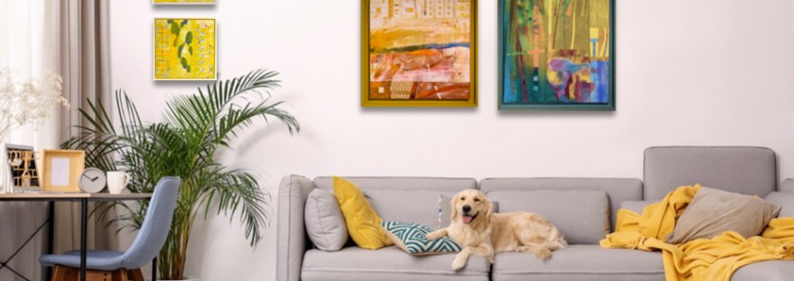
#1 Art should hang at the natural eye level. However, this varies from place to place. In a hallway where one is standing/walking it should be higher than in a living room where one is sitting or a bedroom where one is lying down. General rule of thumb is that the center of your art should hang around 5’ in a ‘standing space’ and in a ‘sitting space’ it is determined by the height of the chairs/sofa bed, at where the eye rests when seated. A bedroom may be even lower still just at the bedside.


#2 Art should match the scale of its immediate surroundings. A very large piece in a small room or small space with standard ceiling height will be over-powering. Vice versa, a small piece may need to be grouped with other art to create enough weight to be noticed in a room.


#3 Art should have negative space around it to show up. One’s eye travels from one interesting item to the next, so if there is no blank space around the art it will be missed and that awe might be gone. Have you ever been in a store chocked full but you couldn’t find anything to buy? Your eye could not rest on anything because there were no in-between spaces.


#4 Art should be lit to flatter its colors and shapes. Gallery lighting is usually neutral (half way between Day Light and Warm Light temperatures) or Daylight calibrated bulbs. So to keep your art looking the same as you saw it, you should consider changing out your light bulbs to the same temperature reading.
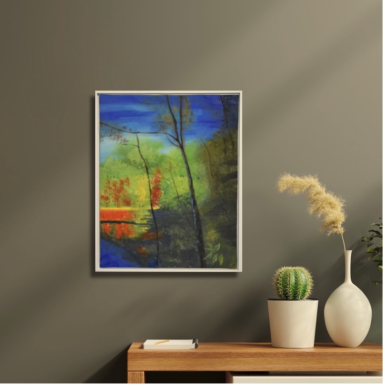


#5 The color of the wall you set the artwork on can really change it. The tone of the paint can bring out certain tones in the art work. Colors that are opposite of each other on the color wheel will make each other more intense. Red paintings on a gray-green wall will look more red for example. However, rules are meant to broken where color is concerned. Neutral beiges and whites are always the least altering colors to hang your art on. But placing art on a colorful walls can make a secondary art statement; your room becomes the art and the hanging piece is the detail within the larger collage.


Have fun hanging your art!
And please take a moment to visit my textile galleries here where new artwork is uploaded seasonally.
A wonderful little tutorial, Jane! ❤️
Thank you Lori!
Thanks, really great info!
Glad it helped you!