
I find the nuances of color & light to be endlessly fascinating. The impressions that combinations make can fool the eye and trick the senses into believing something is, when it is not. Like a world inside a world, shape and content formed by color alone without the added benefit of line is what the Impressionist painters of long ago discovered. And it is this color science that has captured my attention in my recent textile artwork.
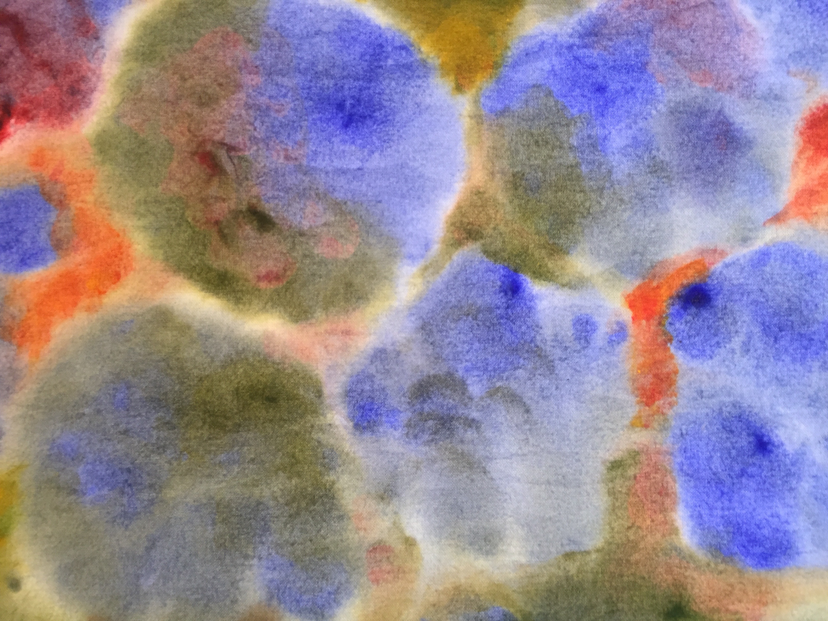
From my own observation, my eye tells me that shape formed through the impressionist style is characterized by the harmony and dissonance of various color combinations. When laid next to each other, colors that are more opposite to each other on the color wheel create a deeper delineation visually producing more shape. Colors that are closer to each other on the color wheel will visually blend more together producing a softer effect.
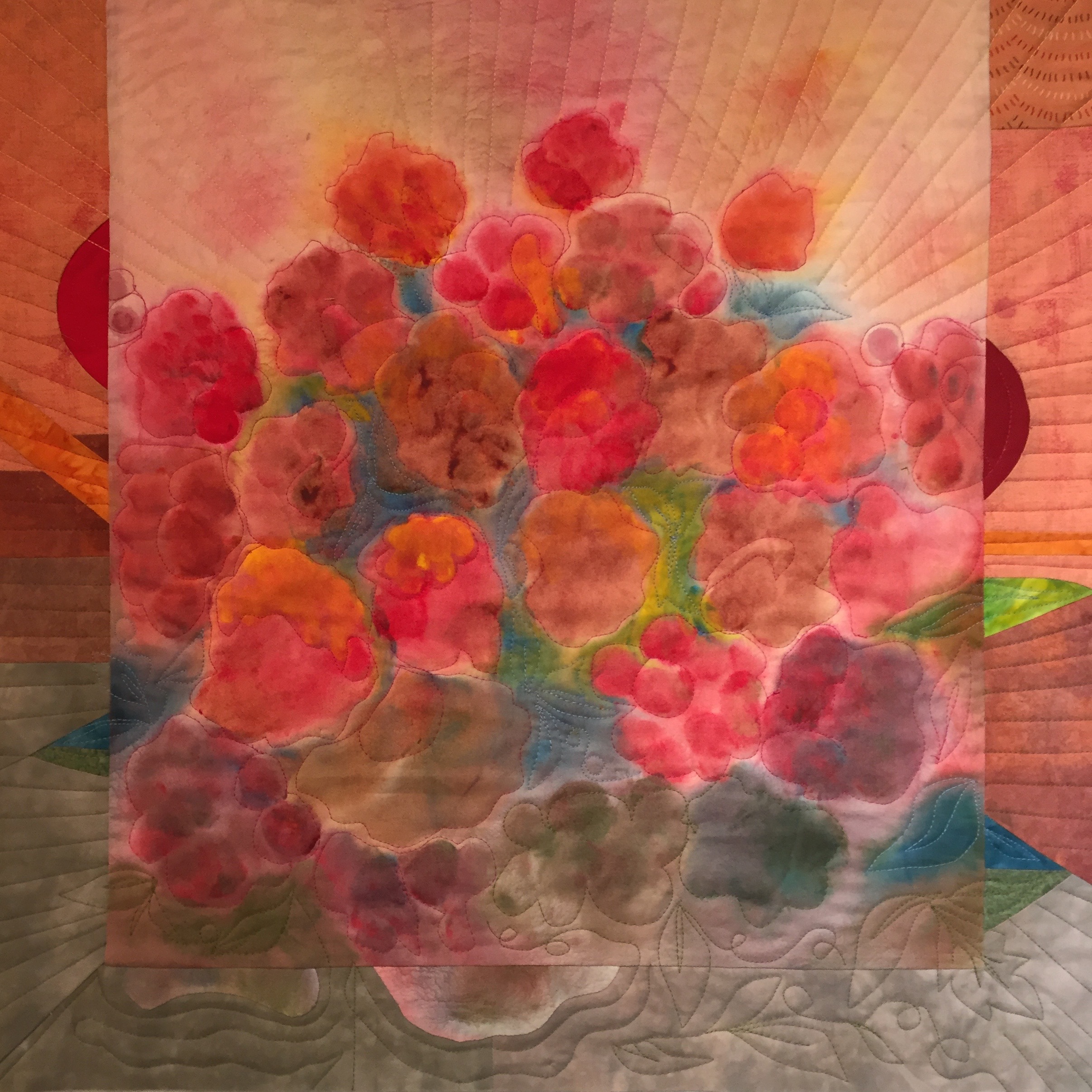
Since all my work begins with painted fabric, for the longest time I have been trying to figure out how to express what I saw in my mind’s eye; a quilted piece in an abstract Impressionist style. Hitting upon a floral motif recently has allowed me to play with this color theory, attempt water-color and give a nod to Claude Monet, my go-to guy for inspiration.
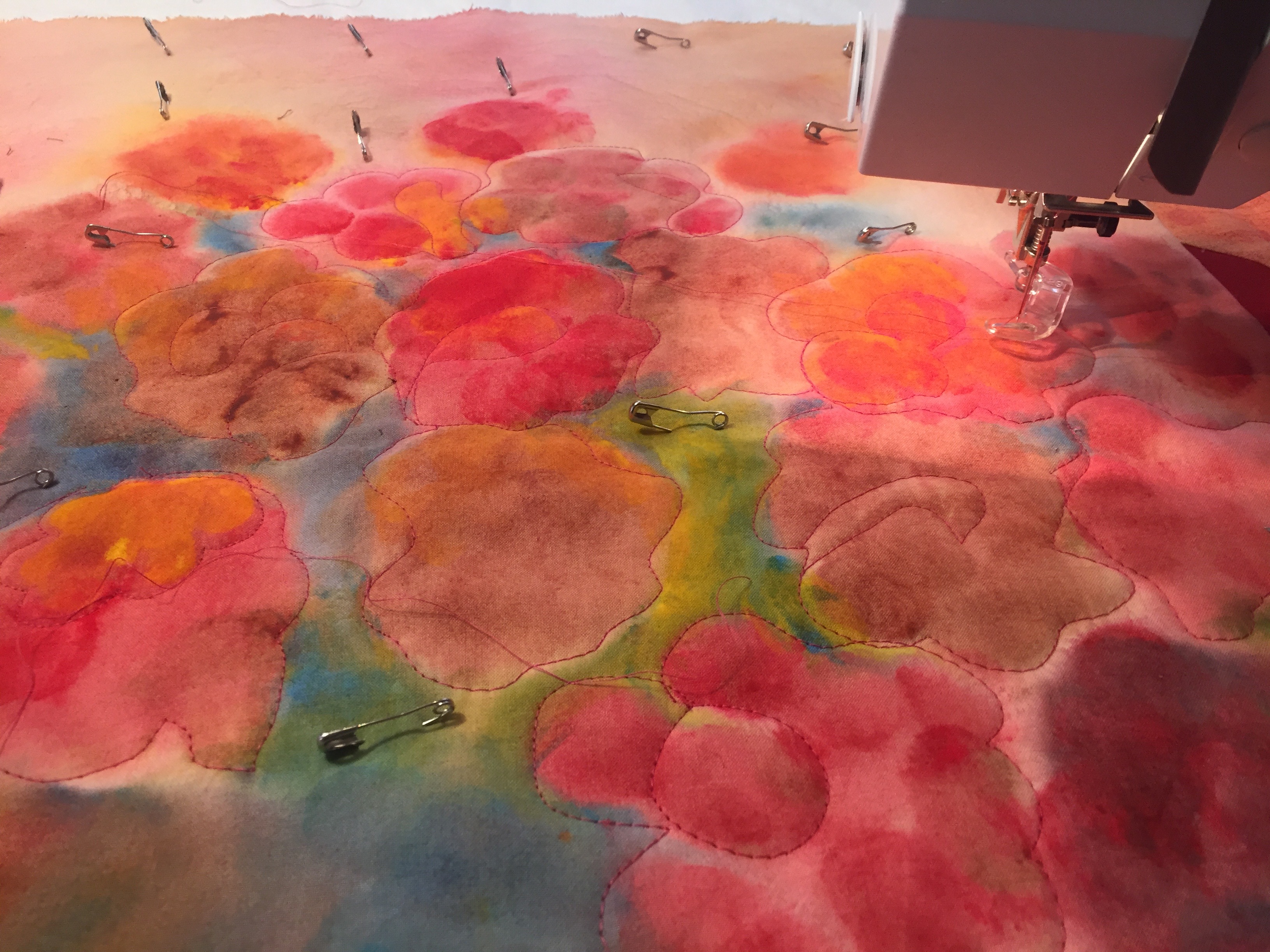
Here is my process: I soak a piece of PDF cotton with water, ring it out a little or a lot (a little produces more pastel work, a lot keeps colors more saturated) then spread it out taut on my painting board. I then paint with a round tipped brush using loose squiggly motions leaving white space in between each “flower” allowing for the color to bleed outward to connect them and leaving greater space in between where I come back to paint the green leaf background. I vary the back ground colors, some tonally closer to the flower color to blend in and some more opposite the flower colors to make them pop out. I blend my own paints. I use Jacquard textile colorless extender base and Createx pure pigments to tint it.

I then let the painted cloth completely dry flat on the board then peel it off to heat set the finished work with a very hot iron. If I want to reinforce the water-colorey pastel blur then I wash it and dry in dryer. If I want a more crisp look then I use simply use as-is.
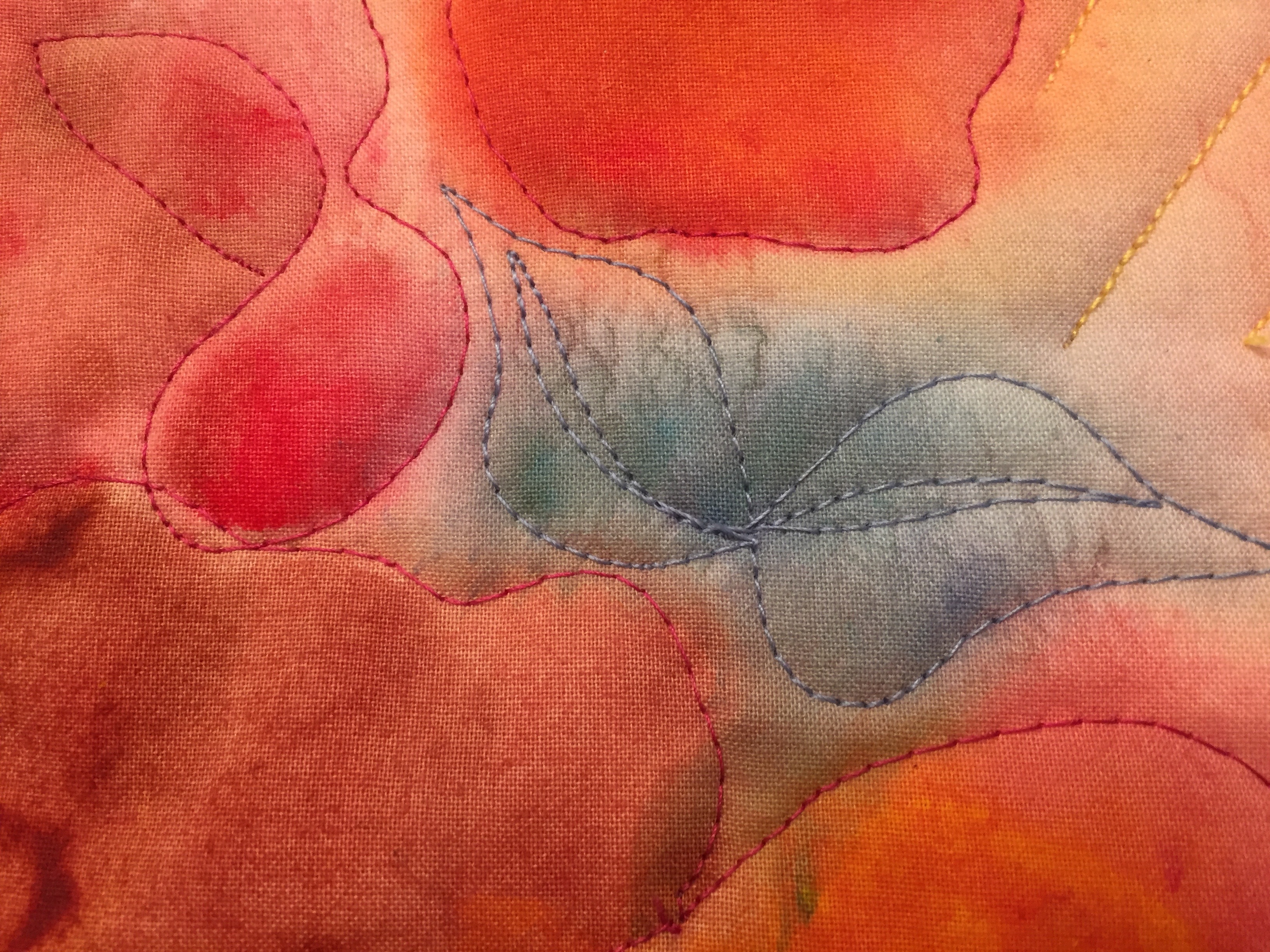
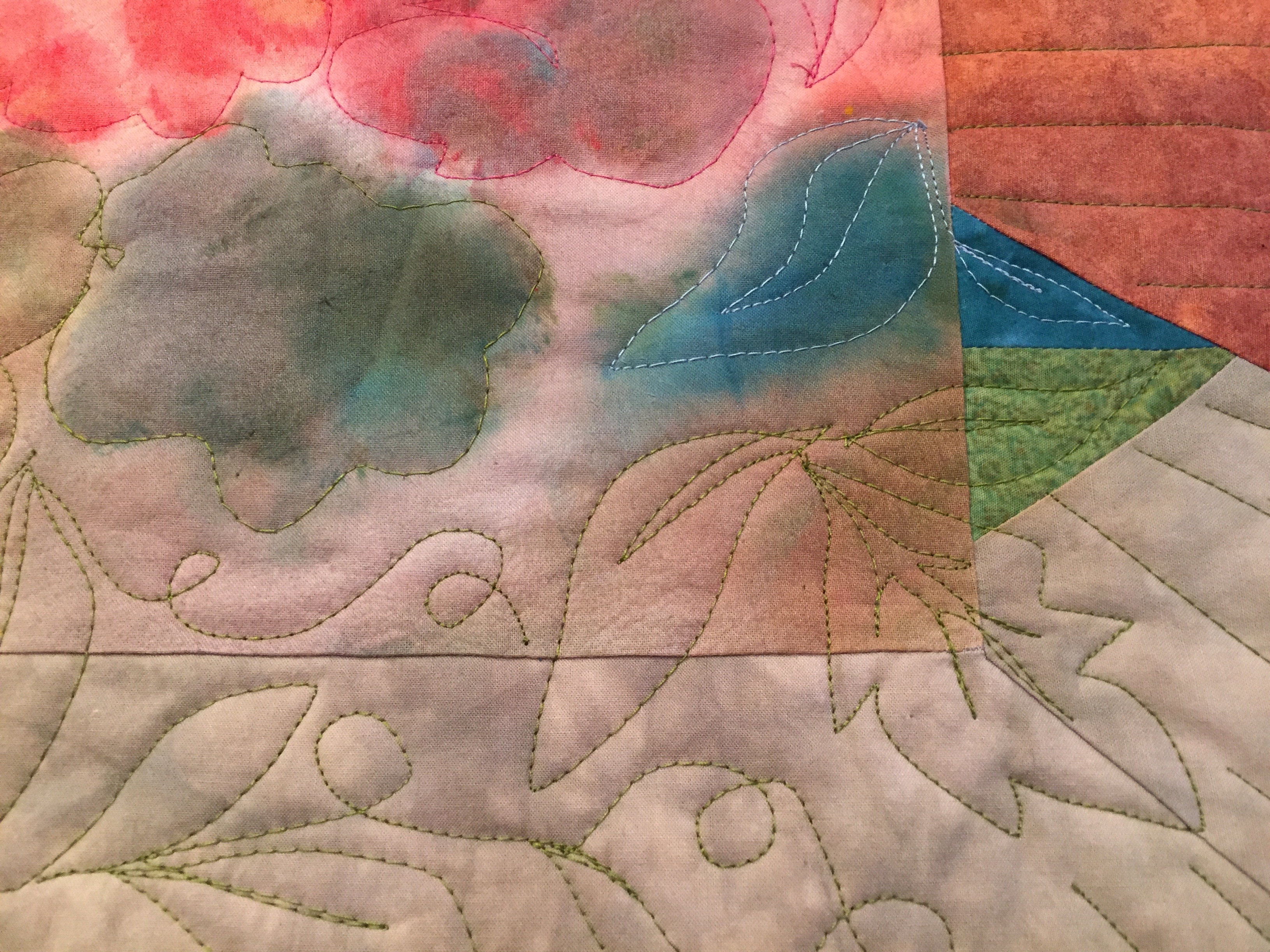
When I quilt, I choose thread colors to reinforce the afore-mentioned color principles, quilting with thread colors that will add more or less shape. I like the flowers to pop and the leaves to set back in so I have been quilting the flowers with Complimentary or analagous threads while the leaves are mostly quilted with monochromatic threads.
Initially, when analyzing each individual step, the work seemed too loose or not defined enough. However, in the end I feel it all comes together into a vibrant impression of flowers. What do you think?


What do I think? Love them!!
Thank you!!!
Love the way you have framed the compositions!
Thank you Lynn.
Beyond beautiful…wishing I could see them and u in person!
Gosh I wish you could be too!
Gorgeous use of color Jane. Truly inspired!!
Thank you and THANK YOU for noticing/commnenting!!
Your quilts are so creative, good luck with the show.
Thank you; it will be a fun week-end!
OMG ,YOUR QUILTS ARE MAGNIFICENT!!
Monet would be jealous! Your flowers would compete with his Water Lilies
You have a ton of talent and creativity!,,,
Oh Carol!! What a compliment! Thank you….I feel inspired to keep going with ’em.