
Color has a visceral effect on us and, when repetitively combined with shape, can powerfully imprint our memories. As an art form I find this an endlessly fascinating method of creative expression. Think about it; Stop Sign red or a white apple or golden arches…Iconography in our daily life trains us, reminds us – even sells us – and therefore creates emotion.
When I started up my aesthetics business again after having retired from it years before, I used symbolic hues to reinforce the principles of my color theory. To represent the three color groups I chose a yellow skin tone peach, a red hued pinkish skin tone and a blue based cherry skin tone for my interior/exterior design as well as my graphic design.

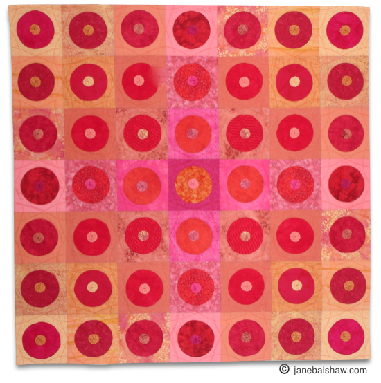

I laid the floor in the aesthetics studio and painted the entrance hallway stair treads with these colors. I made quilts for the walls in these colors…And I created a logo for my skincare products….

Combined with the circle shape, this color combination has been a subtle nod what I did, and now has evolved to become how people find me in my rural surroundings.
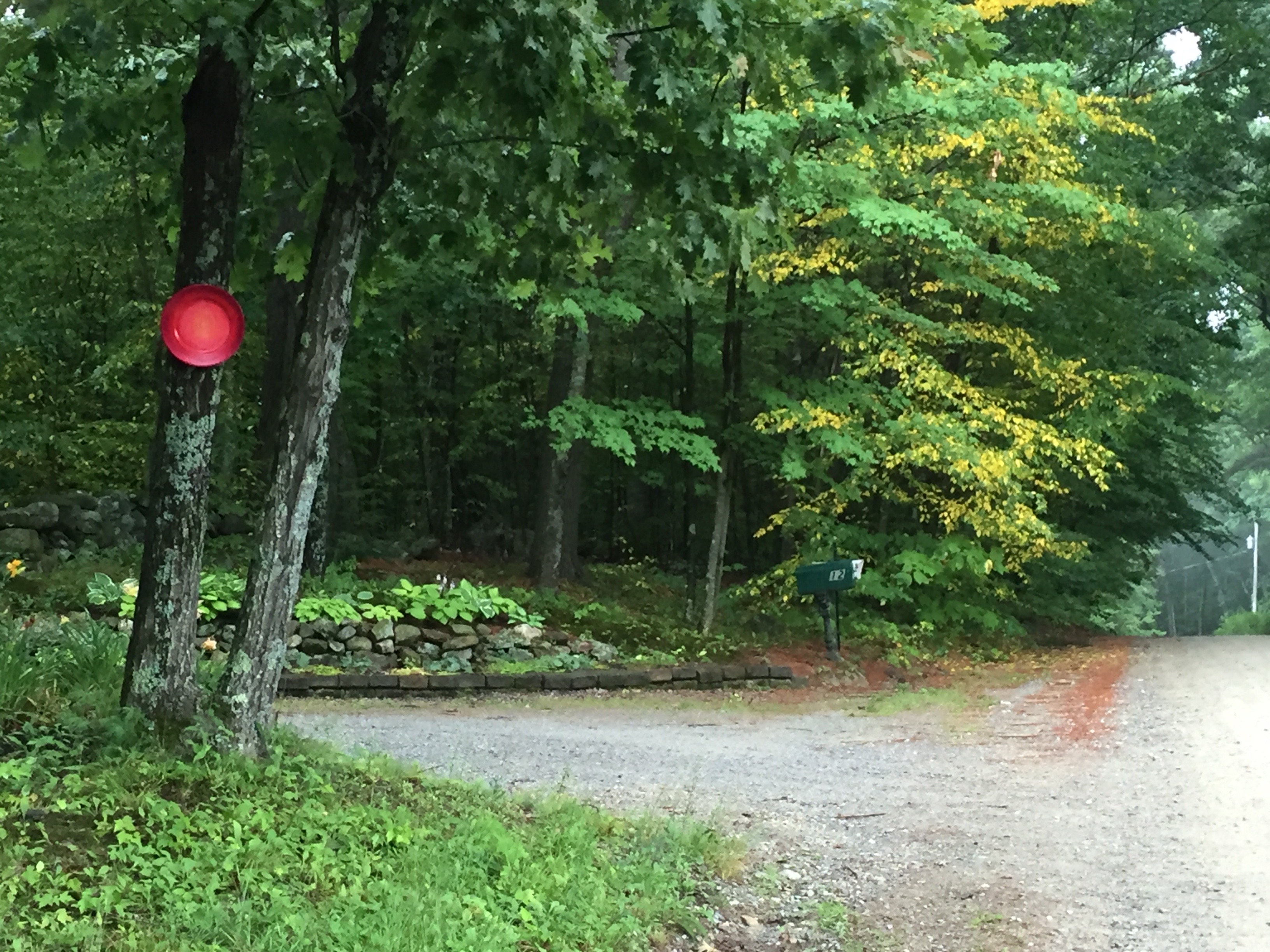
In preparing for my open studio a couple week-ends ago I decided at long last to hang a larger road sign at the back of our property along a well-traveled rural state route. I should have done it years ago but being timid combined with the promise of a very complicated process made it all daunting. I finally took the challenge.
I designed the sign myself then purchased the light weight Alupanel sign board and vinyl lettering from my local sign company, Advantage Signs (they have been incredible to work with!) I applied the lettering then I painted my own circle logo using artist’s acrylic paint sanding the board first then sealing it with a water-based clear polyurethane.


The sign itself was huge and because it needed to be hung from a tree I hired an arborist to hang it for me.

And, while this sign has presence, many people still miss the turn to my studios so I used iconography to direct them further. The town I live in says “only one sign per business” so symbols were the only way to direct people here. I positioned the circles and color all along the route leading right up to the studio doors.


Creativity happens when you least expect it. Let me know how you feel about this post!
You’ve taken well to our grandfather’s profession of sign painting, and I love the pops of color leading to your studio! It all works just beautifully!!!
Thank you sissy! it’s kind of fun to think about the fact that I might have gotten some of this from him.
Jane, I love the colors and it all looks gorgeous, but that is no surprise from you!
Best, Joy
Thank you Joy…I am pleased you read the post! Hope all is well up and over there. ox
Jane, your garden looks like the perfect spot for renewal, and your photography…wow.
Miss you,
Sandy
Thank you Sandy. Summer is a busy time so hopefully we can connect in the fall. ??
Oh my – every picture is so beautiful- and I love that you truly have gotten over your fear of pink and how beautifully you tie it in to your palette.
Sent from my iPhone
>
Patti thank you and I had completely forgotten about the “pink thing”!! Did I once make a piece of art called The Fear of Pink? I will have to look back in my computer archives.
Jane, as I followed the photo trail to your studio, I was taken back to my fascination with the Lord of the Rings trilogy in college. Back then I studied the woodlands, imaging that small “humans” off on a grand adventure would be revealed by the foliage. Thank you for taking me back to that time of my life. What a fun way you have created for finding the way to your studio- for the grand adventure of a wonderful hour of pampering!
What a great analogy Beth! Maybe subliminally I was doing something more direct people with iconography! Fun to think about and thanks for commenting.
As always Jane your artistic talent shines through beautiful work!!! Xoxo
Well thank you Jules! I should say the same to you…like minds. 🙂