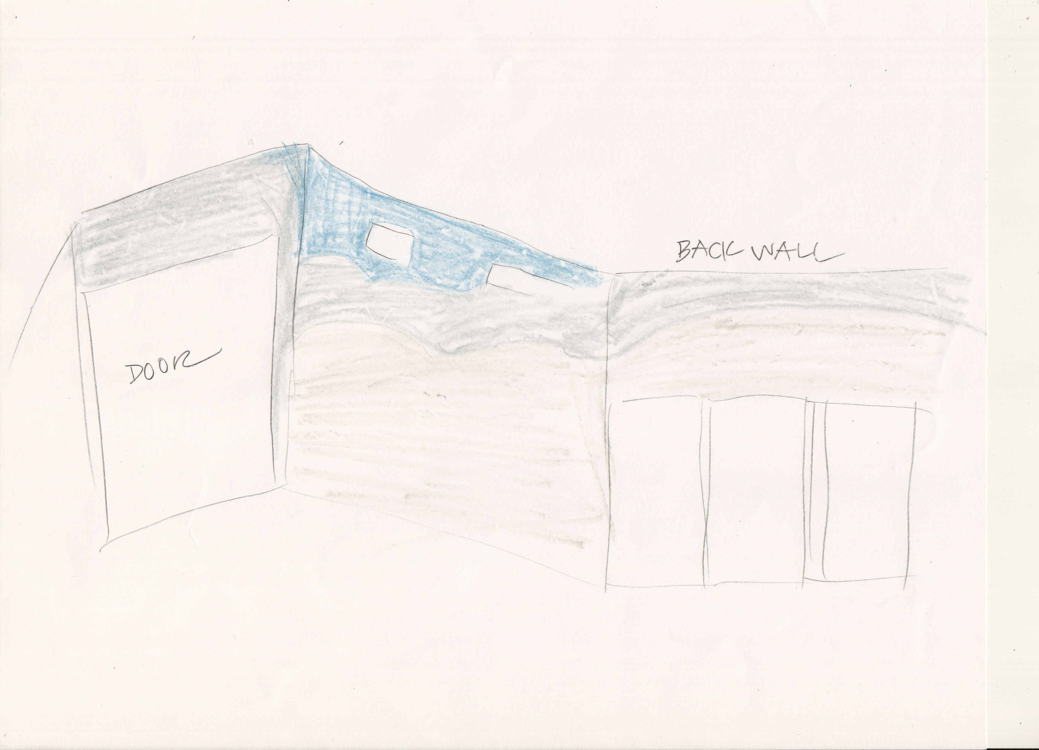
With cabinet designs firmly under construction next came the fun part of creating that backdrop to showcase the work of the League of NH Craftsmen in their new space. As much fun as it would have been to go crazy with fixture design (I am an artist after all) restrain is always needed when showcasing artwork to let the back drop be just that; a supporting role to highlight and magnify the work of others.
On one of our later visits to the space we were surprised to see that the decorative ceiling painting in entire space had extended down into our own open-air retail space. The warm wood-tones of natural maple fixtures combined with this ceiling color [Sherwin Williams “Secure Blue”] gave me the jumping off point to choose final colors. Another opportunity to remain zen, we were told the ceiling color was “Atmospheric Blue” that we based our gradation on then had to change on the spot.

With the upper part of our wall being the dark blue and having the need for it to be a neutral where our artisans wares were to be placed, I decided on a gradation in the style of the ceiling. “Secure Blue” fading to “Atmospheric Blue” fading into California Paints “Waterloo” then ending with “Stucco Tan”, each color smudged into its previous.

Rule of thumb; when artwork of varying colors, textures and intensities are to be displayed together, the backdrop needs to be a “neutral” color that contains redness, yellowness AND blueness. What we think of as neutral color—like gray for example—may not truly be neutral & can be detracting if it is not balanced with all 3 hues. If you mix red, yellow and blue together you get brown; so think beige and tans for truly neutral.
The volunteer painting crew L to R: Prudy Gagne, the League’s Finance Director and Catherine Green, the League’s Standards & Education Manager. Terri Wiltse, the League’s Operations Manager & Fair Director is taking the picture and was ALWAYS behind the scenes through this entire project!

 Catherine—who is also an artist—doing the delicate job of blending all colors one into another to create the gradation down the wall to end with our perfect neutral. I missed out on all the painting because I was moving into a new home this week.
Also happening during this time period:
- Terri worked with Big Jim’s to have a specialized door designed to fit into the unusually large opening to the space.
- The committee worked with Advantage Signs to design a sign for the exterior of the space utilizing an artisan-made wrought-iron hanging post recycled from the Concord League gallery.
Next post will show setting up the shop!


Jane, I am loving this! I had no idea you were a part of this, how exciting! They are so lucky to have your talent and vision working on this! xoxox
I am so happy you are following this!! Well aren’t WE all lucky to have the LEAGUE standing up for us!!