


It’s hard to choose interior paint color for a multi-windowed open-concept house when each area has a different light exposure. The color changes in each direction. We were fortunate that the previous owners of our old house had freshly painted most of the walls a lively cream color with touches of red, yellow and blue undertones making it work everywhere.But other paint colors did not work. Here is how we backed out those tones to get what we wanted in each windowed area.
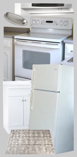
RULE OF THUMB: when choosing paint color for a room, start with a focal point object (a rug, an artwork, etc) and coordinate your wall colors to that. For the downstairs adjoining rooms—since this a rental house where people will have their own objects and we needed to stay neutral—we pulled color tones from the appliances and fixtures that would coordinate with that existing lively cream. Neutral gray, cool white and warm gray stainless & brushed nickel.
The kitchen at one end of this open space gets north light which has a blue cast to it making all this even more cool toned while the adjoining living/family/dining room also gets northwest light (icy yellow) also with one window that gets filtered southern light (warm yellow).
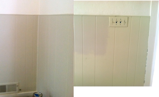
The wainscot accent to the Half and Half in the living room was painted Navajo White, a normally neutral warm beige. But the blue-yellow light in that room emphasized its olive green undertones [the presence of raw umber in the tint] making it really clash with the gray color scheme.


We envisioned a warm putty gray…we loved the color swatch at the bottom but it looked dark and charcoal in the room. So we tried the other lighter swatches to the left but they looked stark and colorless. Believe it or not, the swatch on the furthest right ended up looking like the swatch on the bottom once on the wall in that room. Adding the blue-yellow light to it grayed the color.We had pictured this putty color on the walls in the kitchen but with the blue north light Cream Wave looked too dark and too gray; Half and Half “reads” similarly to the wainscot at the opposite end of this open space. The blue northern light toned out the yellow in the paint leaving it gray like we wanted.

Half and Half in the upstairs of the house continued to look wonderful. In the shadowy spaces it looked darker but still lively due to the red, yellow and blue components. But in the upstairs bath with a south-facing skylight, the warm yellow light made Half and Half look peach. We settled on French White, a cooled down slightly taupey color to go with the new counter tops (see before and after in a later post.)
COLOR CALCULATOR:
- When your swatch looks to gray or dull, step by step until it looks right choose other colors that are more yellow progressing to peach to counteract what the light does in that space.
- When a color looks too bright, step by step until it looks right choose other colors that are more muted and grayed to counteract the strong light in that space.
- View your swatches at 3 times during the day, morning, noon and evening. Light is most yellow at noon and cooler at opposite ends of the day.
Lovely range of neutrals… the light in New England does tend towards a blue cast, especially at this time of year!
Thank you…and winter with the cool light off the snow! That’s when things get really gray. This is why my kitchen cabinets are mustard – it’s always sunshine!
Wow, so much more science than I thought! Wish I had read this post a year ago when I was given 3 weeks by my contractor to choose all my paint colors! It took every waking minute of that 3 weeks to get the job done. Not to mention endless paint samples painted onto foam core board, and hour-long trips to the paint store. Our architect took pity on me and helped select one color…. Benjamin Moore Edgecomb Gray…. sort of a sand color. Because we are open concept, it covers the kitchen, dining room, living room, entry, stairwell, upstairs hall and loft. A huge relief! From there, it got easier.
Light does make a huge difference, and what looks fabulous during the winter can look just awful in the summer. We face west, but have light coming in from all four directions. So it’s like having a new paint job each season!
Keep the posts coming…. I love this project! (Do you ever watch the Rehab Addict on HGTV???)
Lynn
Thank you Lynn for all the encouragement! And yes I do watch Rehab Addict – we are kindred souls. In fact I have watched all the shows for years starting with This Old House in its wee beginnings.
Such fun to read how you went through the process, Jane. You are my color goddess! 🙂
Ahhh Lori…thank you. 🙂