I have fallen in love with the color white.
I can’t think of when this affair started exactly but a couple of years back I started surrounding myself in it. My rooms have become white, I am collecting white brick-a-brack but most noticeably white has become the back drop color for almost all of my current artwork.
Perhaps it is that I have fallen in love with power of negative space; the void that draws the eye to content, the space that defines its center. White is clarifying and when its particular shade is tinted properly, helps illuminate its coordinating colors.
My current white paint favorites:
For a balanced, rich yet lively white that goes well with warm and cool tones, I have painted many rooms in my home with Benjamin Moore’s White Dove…I painted the trim with Sherwin William’s Dover White a slightly browner and darker hue of the same tone to emphasize the woodwork and create a layered look.

Jeff and Suzanne just painted the interior of their historic New England colonial home. We choose Benjamin Moore’s Marble White because it contained that complex red/yellow under-tone like the wall colors…


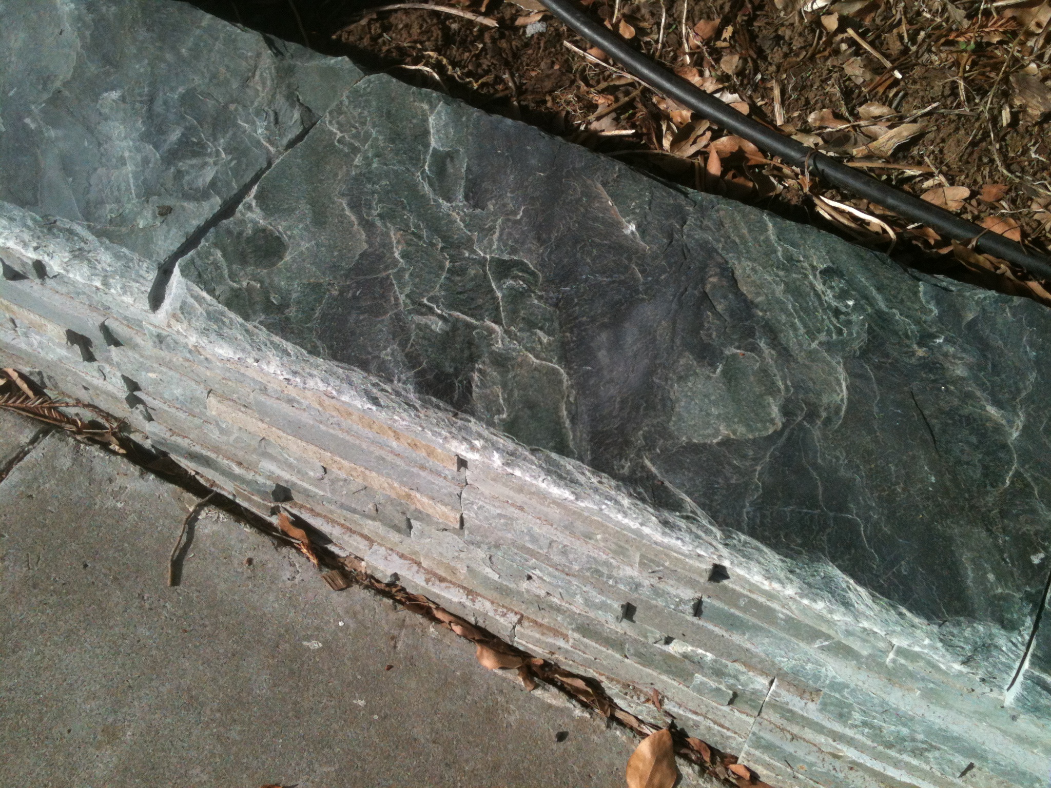
Deb and Mark are painting the outside of their California shingled Victorian-era home. They wanted a creamy white to go with their gray-green color scheme inspired by the beautiful new stone wall just installed.
We choose Benjamin Moore’s Vapor Trails to pick up the gray tones in the greens for the body of the house while coordinating with some existing vinyl window frames so all the trims will all look cohesive.
When choosing a shade of white to paint with, consider what other colors in the room it will be placed next to. For example, if your wood floors are golden then your white should have a golden tone, if your carpet is taupe colored then your white should have a cool gray-brown tone. The same is true with wall colors; think warm or cool, red, yellow or blue undertones. And most importantly, view your potential color choices in the room you will be painting them in. Light changes everything!
My artwork featured above; hand painted and printed cotton, reverse appliqued, stitched and stretched. Jane Balshaw ©2013


Beautiful fiber work, thanks for sharing it! Are you familiar with Yoshiko Jinzenji’s work? And White Dove, one my of favorite BMoore whites, works especially well in the cool light we have here in Northern New England. It’s been interesting to see the formula for it change over the years…
Thanks for commenting! And so happy you like my fiber work! Yes White Dove is good for our cool northern light… Didn’t they change the formula back when they introduced the Color Preview palette? That is when they brought out the new pigments. Remember everyone screamed because they took away the original colors then had to bring them (and their pigments) back as the “Classic” palette.
Jane
And yes, I do know Yoshiko’s work. Love it!